#
Font Awesome picker
1.0.0+
#
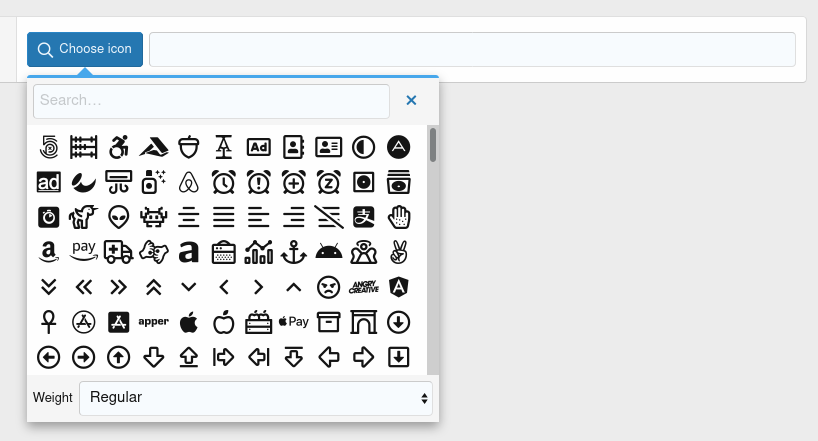
Basic usage
<xf:macro name="tc_clib_fa_picker_macros::fa_picker"
          arg-name="icon" arg-value="far fa-gavel"
          arg-row="true" />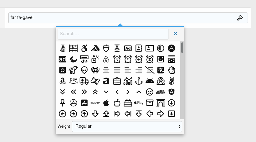
#
Arguments of tc_clib_fa_picker_macros::fa_picker macro
#
TeslaCloud.FontAwesomePicker (tc-fa-picker)
#
Arguments
#
Examples
#
Opening menus with custom triggers
To add a custom trigger, the js-faPickerTrigger class must be added to the element.
Example of using a button as a trigger:
<xf:css src="public:tc_clib_fa_picker.less" />
<xf:comment>For XenForo 2.1.0+:</xf:comment>
<xf:js src="TC/ComponentLibrary/fa_picker.js" addon="TC/ComponentLibrary" min="1" />
<xf:comment>For XenForo 2.3.0+:</xf:comment>
<xf:js src="TC/ComponentLibrary/font_awesome.js" addon="TC/ComponentLibrary" min="1" />

<xf:formrow>
    <div class="inputGroup tc-fa-picker" data-xf-init="tc-fa-picker" data-no-box="true">
        <xf:button fa="fa-search" class="js-faPickerTrigger">Choose icon</xf:button>

        <xf:textbox name="test" dir="ltr" />
    </div>
    <xf:macro name="tc_clib_fa_picker_macros::fa_picker_menu" />
</xf:formrow>