# Select2

# Basic usage

<xf:macro name="tc_clib_select2_macros::select2_includes" />

<div class="block">
    <div class="block-container">
        <div class="block-body">
            <xf:selectrow data-xf-init="tc-s2-select" label="OS" placeholder="Choose…">
                <xf:option></xf:option>
                <xf:optgroup label="Desktop">
                    <xf:option value="linux">Linux</xf:option>
                    <xf:option value="windows">Windows</xf:option>
                    <xf:option value="osx">OS X</xf:option>
                </xf:optgroup>
                <xf:optgroup label="Mobile">
                    <xf:option value="android">Android</xf:option>
                    <xf:option value="ios">IOS</xf:option>
                    <xf:option value="blackberry">BlackBerry</xf:option>
                </xf:optgroup>
                <xf:option value="other">Other</xf:option>
            </xf:selectrow>
        </div>
    </div>
</div>

Базовое использование

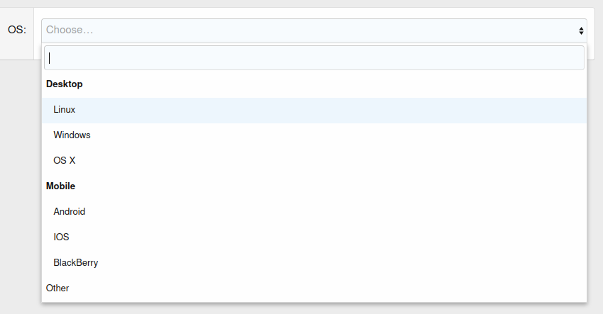
# TeslaCloud.S2Select (tc-s2-select)

# Arguments

Argument Default value Description Select2 option
allowClear* false If true, a clear button will be added to the select box. allowClear
closeOnSelect* true If true, the dropdown will be closed after selection. closeOnSelect
dropdownAutoWidth false dropdownAutoWidth
dropdownCssClass Additional CSS classes for the dropdown list.
:all: add all classes contained in the original <select> element.
dropdownCssClass
dropdownParent* $(document.body) Selector for setting the placement of the dropdown. dropdownParent
maxLength* 0 The maximum number of characters for a search query.
maxLength < 1 — unlimited.
maximumInputLength
maxSelection 0 The maximum number of options that can be selected.
maxSelection < 1 — unlimited.
maximumSelectionLength
minLength* 0 The minimum number of characters required to start a search. minimumInputLength
minimumResultsForSearch* 0 The minimum number of options required to display the search box.
minimumResultsForSearch < 0 —  disable search.
minimumResultsForSearch
selectionCssClass Additional CSS classes for the selection container.
:all: will add all classes present in the original <select> element.
selectionCssClass
selectOnClose* false If true, after closing the dropdown list, the option highlighted before closing will be selected. selectOnClose
tags* false If true, custom values will be allowed. tags
theme* tc-clib_s2select theme
tokens [','] List of characters to use as token delimiters. tokenSeparators
width* 100% Container width setting. width
scrollAfterSelect* false scrollAfterSelect
searchUrl URL for search queries.
data* null An array of options objects. data
resultTemplate** {{{styledText}}} Template for displaying an option in a dropdown menu.
resultTemplateIconic** {{{iconHtml}}}&nbsp;{{{styledText}}} Template for displaying a choice option with an icon in a drop-down menu.
selectionTemplate*** {{{text}}} Template for displaying the selected option.
selectionTemplateIconic*** {{{iconHtml}}}&nbsp;{{{text}}} Template for displaying the selected option with an icon.

* See Select2 documentation for details.
** See Dropdown - Templating and Templating.
*** See Selections - Templating and Templating.

# Receiving data via AJAX

In addition to generating a list of options from HTML, it is possible to load data via AJAX.
To enable AJAX loading, the URL for search requests must be specified in the searchUrl parameter.

After changing the value in the search field to the specified URL, a GET request will be executed with the following parameters:

Parameter Description
term The current search query in the search field.
q Contains the same as term.
_type Request type. If a request is made to the first page — query, otherwise — query_append.
page Number of the requested page. The parameter is present only in requests with pagination.

In response, the server must return a response with the following content:

Key Description
results* An array with search results. See below.
pagination Pagination.
The only parameter is more, if true, when scrolling to the end of the list, a request will be made to the next page.

Search results without grouping:

Key Description
id* ID of the result that will be used as the value of the value option. Any value other than zero.
text* Option text.
selected If true, the option will be selected by default.
disabled If true, the option will not be available for selection.
iconHtml HTML code for the icon to be displayed.
q Current search query. Used to highlight a match.

Search results with grouping:

Key Description
text* Group name.
children* An array with search results. Same as without grouping.

* Required

# Example of user search

<xf:macro name="tc_clib_select2_macros::select2_includes" />

<div class="block">
    <div class="block-container">
        <div class="block-body">
            <xf:selectrow data-xf-init="tc-s2-select"
                          label="Username" placeholder="Enter username…"
                          data-min-length="2" data-search-url="{{ link('members/find') }}" />
        </div>
    </div>
</div>

Поиск пользователей
Поиск пользователей

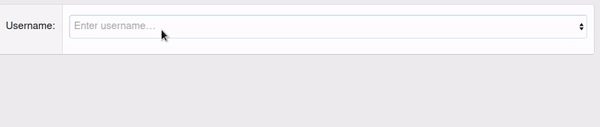
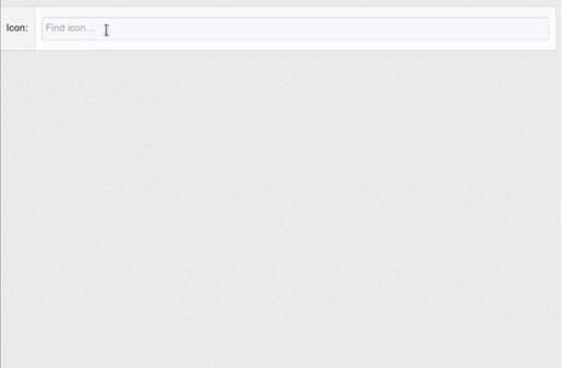
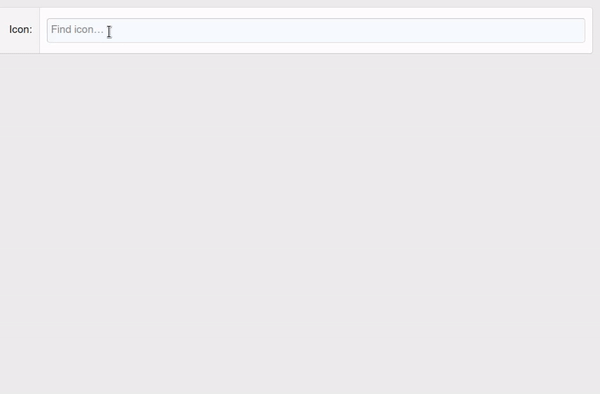
# Example of searching for Font Awesome icons

<xf:macro name="tc_clib_select2_macros::select2_includes" />

<div class="block">
    <div class="block-container">
        <div class="block-body">
            <xf:selectrow data-xf-init="tc-s2-select" multiple="true"
                          label="Icon" placeholder="Find icon…"
                          data-min-length="2" data-search-url="{{ link('demo/find-fa-icon') }}" />
        </div>
    </div>
</div>

Controller code:

<?php

namespace Demo\Pub\Controller;

use XF;
use XF\Mvc\Reply\View;
use XF\Pub\Controller\AbstractController;

class Demo extends AbstractController
{
    /**
     * @return View
     */
    public function actionFindFaIcon(): View
    {
        $results = [];

        $query = $this->filter('q', 'str');
        if ($query)
        {
           foreach (XF::app()->data('XF:FontAwesome')->getIconMetadata() as $icon => $data)
           {
              if (
                 stripos($icon, $query) === 0
                 || stripos($data['label'], $query) === 0
              )
              {
                 $results[] = [
                    'id'   => $icon,
                    'text' => $data['label'],
                    'q'    => $query
                 ];
              }
           }
        }

        $reply = $this->view();
        $reply->setJsonParams([
           'results' => $results
        ]);

        return $reply;
    }
}

Поиск иконок FontAwesome

# Templating

Select2 allows to change the appearance of selected options and dropdown menu list. To do this, in TeslaCloud.S2Select it is possible to specify templates compiled by the mustache.js library.
Templates are specified by the selectionTemplate and resultTemplate parameters for the selected options and dropdown menu, respectively. Option templates with icons are passed as parameters with the Iconic postfix (resultTemplateIconic and selectionTemplateIconic).

The following variables are available in templates:

Variable Description
id ID of the result that will be used as the value of the value option. Any value other than zero.
text Option text without formatting (as it was in the option body or when searching via AJAX).
styledText Formatted option text. When searching via AJAX, matches to the search query will be highlighted with <strong>.
selected If true, the option will be selected by default.
disabled If true, the option will not be available for selection.
iconHtml HTML code for the icon to be displayed. The icon code can be set from HTML using the data-icon-html attribute in <option>.
q Current search query. Used to highlight a match.

When searching via AJAX, there may be other variables passed in the server response.

# Example of displaying icons in a list generated from HTML

<xf:macro name="tc_clib_select2_macros::select2_includes" />

<div class="block">
    <div class="block-container">
        <div class="block-body">
            <xf:selectrow data-xf-init="tc-s2-select" label="OS" placeholder="Choose…">
                <xf:option></xf:option>
                <xf:optgroup label="Desktop">
                    <xf:option value="linux" data-icon-html="<i class='fab fa-linux fa-fw'></i>">Linux</xf:option>
                    <xf:option value="windows" data-icon-html="<i class='fab fa-windows fa-fw'></i>">Windows</xf:option>
                    <xf:option value="osx" data-icon-html="<i class='fab fa-apple fa-fw'></i>">OS X</xf:option>
                </xf:optgroup>
                <xf:optgroup label="Mobile">
                    <xf:option value="android" data-icon-html="<i class='fab fa-android fa-fw'></i>">Android</xf:option>
                    <xf:option value="ios" data-icon-html="<i class='fab fa-apple fa-fw'></i>">IOS</xf:option>
                    <xf:option value="blackberry" data-icon-html="<i class='fab fa-blackberry fa-fw'></i>">BlackBerry</xf:option>
                </xf:optgroup>
                <xf:option value="other">Other</xf:option>
            </xf:selectrow>
        </div>
    </div>
</div>

Иконки из HTML
Иконки из HTML

# An example of displaying icons in a list when searching via AJAX

The template is identical to the template from this example. In the controller code, an icon is added to the search results:

                 $results[] = [
                    'id'   => $icon,
                    'text' => $data['label'],
+                   'iconHtml' => XF::app()->templater()->fontAwesome(
+                       ($data['is_brand'] ? 'fab ' : '') . 'fa-' . $icon
+                   ),
                    'q'    => $query
                 ];

Иконки из AJAX
Иконки из AJAX